


A deep dive into branding the world leader in artificial reef creation
ARC Marine
View all projects- 3D Visualisation
- Advertising Design
- Brand Asset Design
- Brand Consultancy
- Branding
- Datasheet Design
- Email Footer Design
- Exhibition Design
- Logo Design
- Market Research
Project overview
A sea of branding opportunities.
For more than a decade, ARC Marine has been a trusted client of White Space. Recently, they turned to us for strategic consultancy to sharpen their business focus, strengthen their global presence, and refresh their brand identity to resonate with their international audience.
The first creative challenge born from this consultancy was the logo. We explored a wide range of fresh design routes, diving deep into possibilities before returning full-circle to an evolved version of their original mark. The result? A contemporary, refined take on the logo that honours their legacy while signalling their global ambitions.
Below, you can see the transformation from the old identity versus its modern successor, setting the stage for a suite of updated brand collateral to follow.
Logo concepts
The logo concepts that didn't make the cut.
As a UK-based company with a truly global reach, we explored a wide variety of logo concepts that played with different aspects of ARC Marine’s identity. Some designs leaned into the idea of science, research, and innovation, while others took inspiration directly from their flagship product, the Reef Cube. In several iterations, we even wove a subtle ‘A’ for ARC into the motif. Although none of these concepts made it to the final cut, the process was invaluable. It allowed us to push creative boundaries, explore fresh directions, and ultimately reaffirm that the most powerful solution was a contemporary evolution of the existing logo - a conclusion the entire ARC Marine team embraced.
Service and Product Logos
Service and Product logos that help set the tone for this B-Corp accredited brand.
Next, we turned our attention to the Service division logos. Designed to complement the main ARC Marine identity, each one carried through the same typeface, styling, and the signature ARC swoosh motif. To bring individuality while keeping consistency, we developed a tailored colour palette for each division. The colours not only captured the essence of the service area but also sat in perfect harmony with the core brand and its sister logos. The result was a cohesive, synergistic family of service identities.
When it came to Product logos, we retained ARC Marine’s corporate blue for the motif graphics, while keeping typography and treatments aligned with the master brand and service logos. This unified approach created a seamless visual system across business, services, and products. Each product motif took inspiration from the product itself, with the Reef Cubes receiving a clever twist, subtly shaped to suggest a fish. Smart, distinctive, and unforgettable.

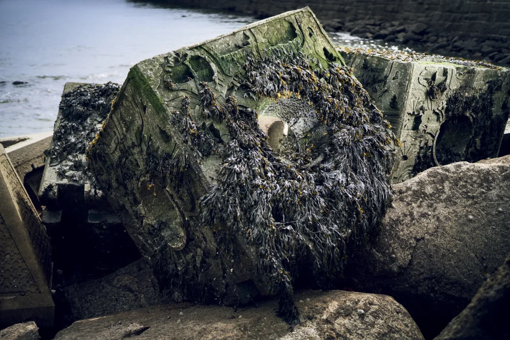
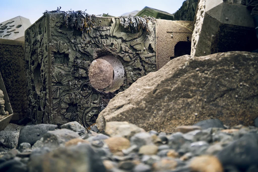
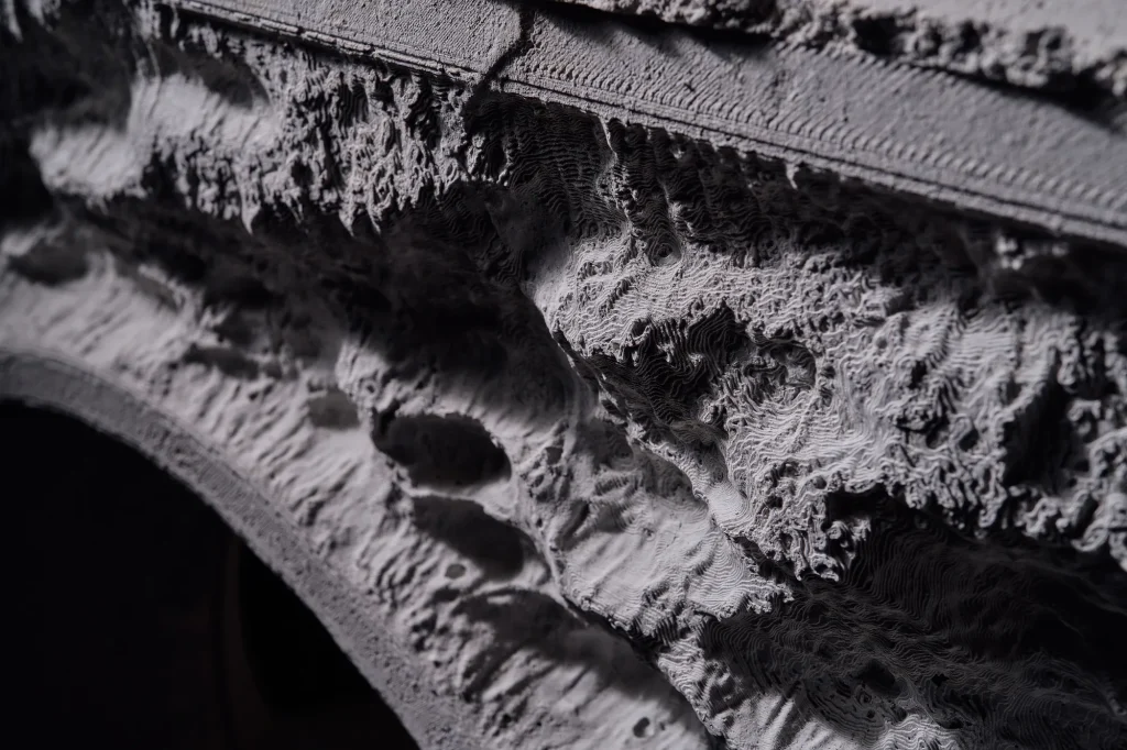
3D CGI Imagery
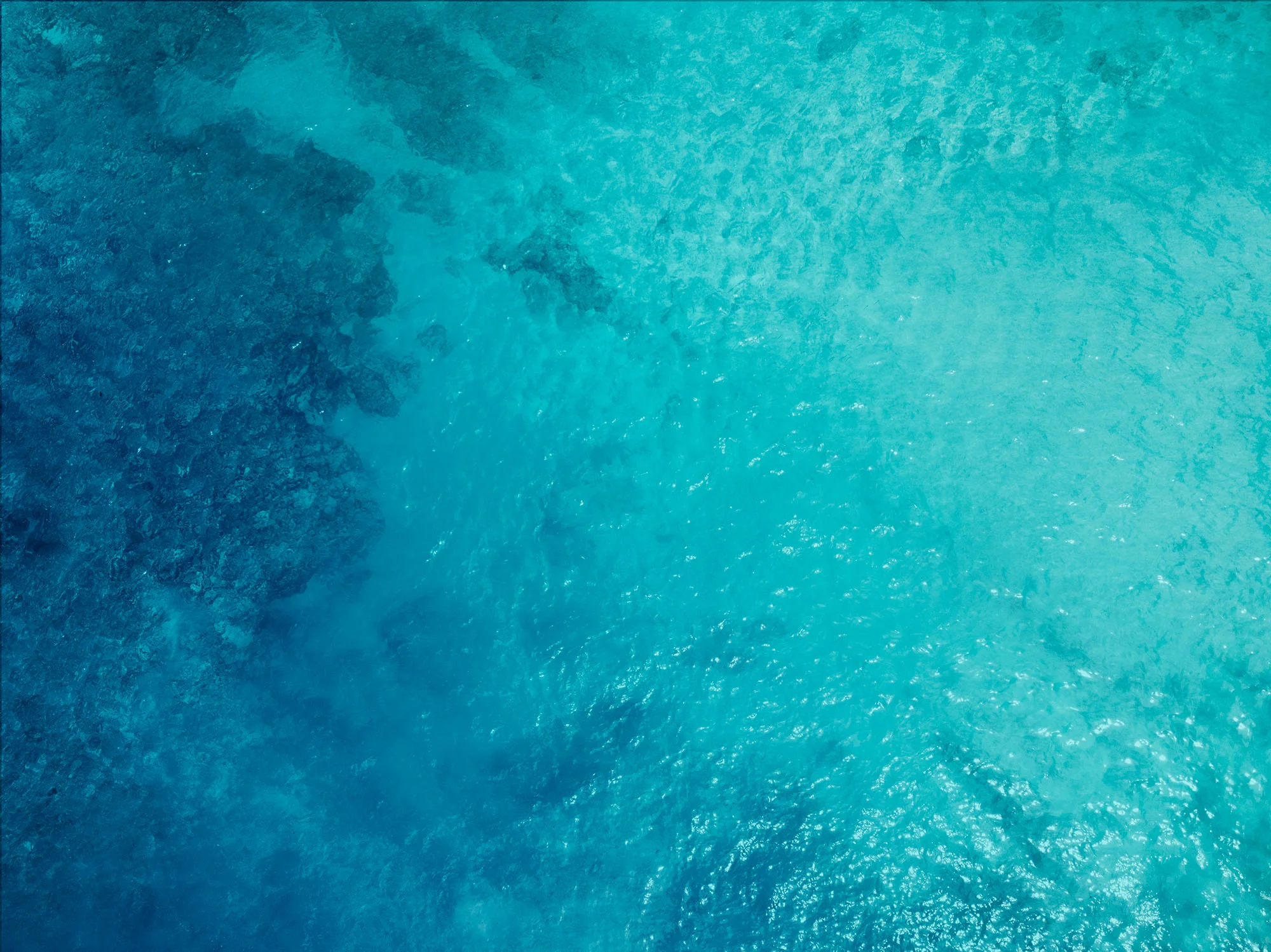
How do you capture compelling imagery when photographing beneath the ocean presents significant logistical challenges?
With many artificial reef installations located in colder, less tropical waters, often at challenging and murky depths around offshore wind farms, capturing photography wasn’t just logistically complex, it was highly restricted. Strict training requirements and rigorous health and safety regulations made underwater shoots near wind farms virtually impossible. Our solution? To bring the unseen to life with dynamic 3D Computer Generated Imagery (CGI). This not only allowed us to visualise the environments where the reefs are installed, but also to showcase, in detail, how the artificial reef products integrate within those structures, something traditional photography simply couldn’t achieve.


3D Animation
Creating an animation to demo ROV cable protection.
Working closely with ARC, we choreographed and created a 3D rendered animation to demonstrate how versatile and revolutionary reef cubes are.
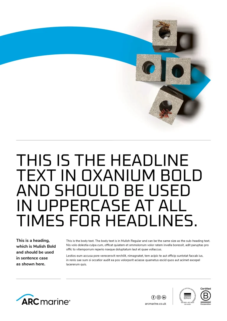
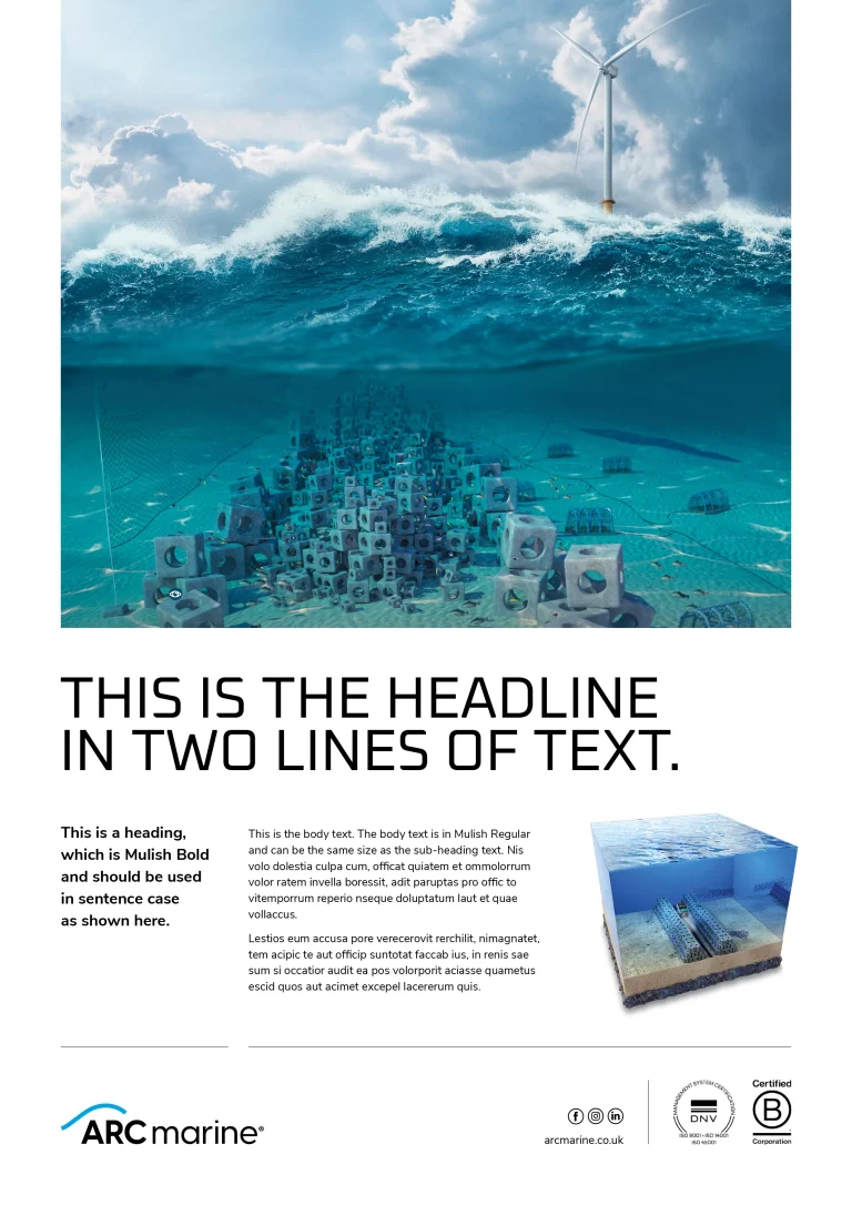
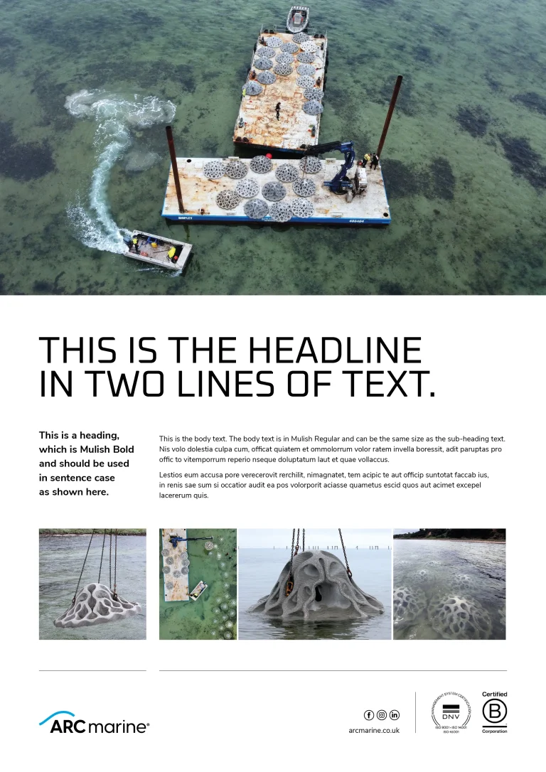
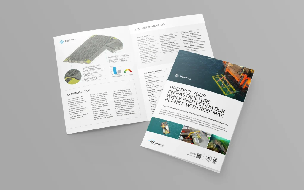
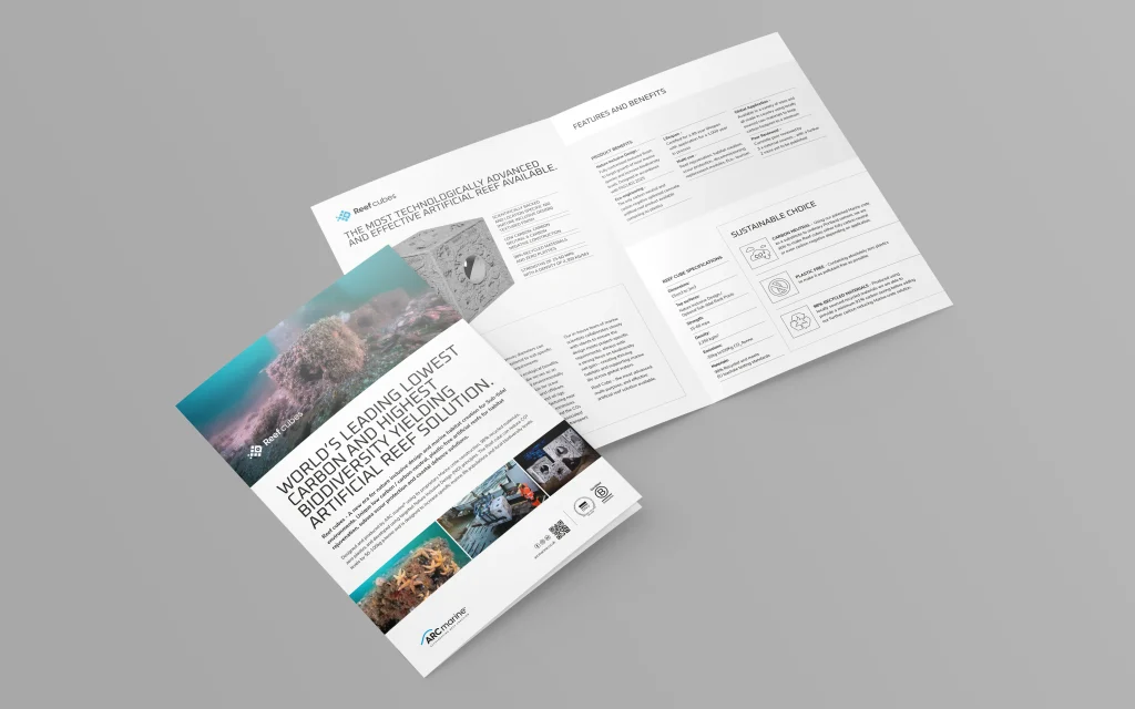
Product brand design
To be a serious player in their market, ARC Marine needed to show their revolutionary stackable ‘reef cubes’ in their best light. We focused on producing the best imagery and 3D visuals possible to demonstrate this.

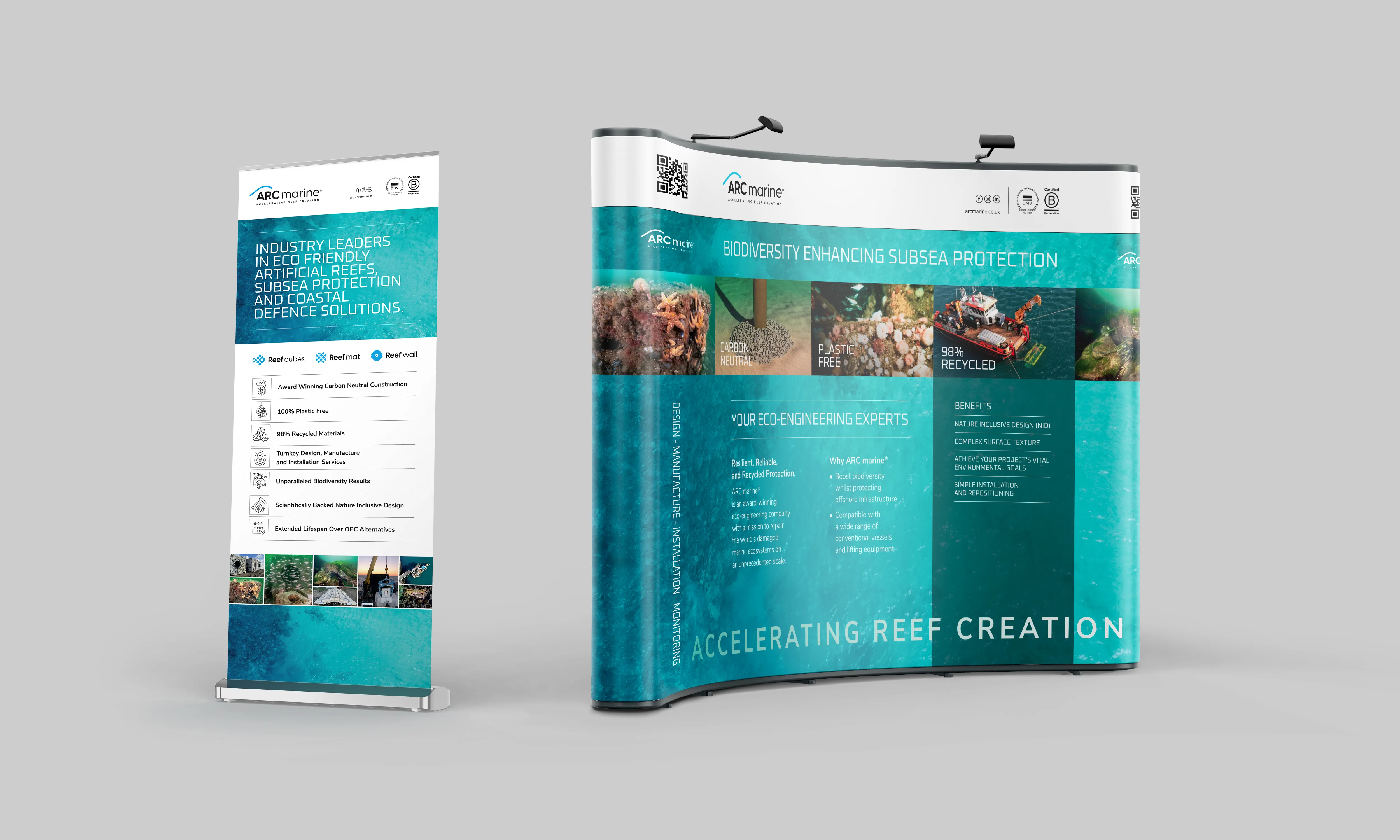
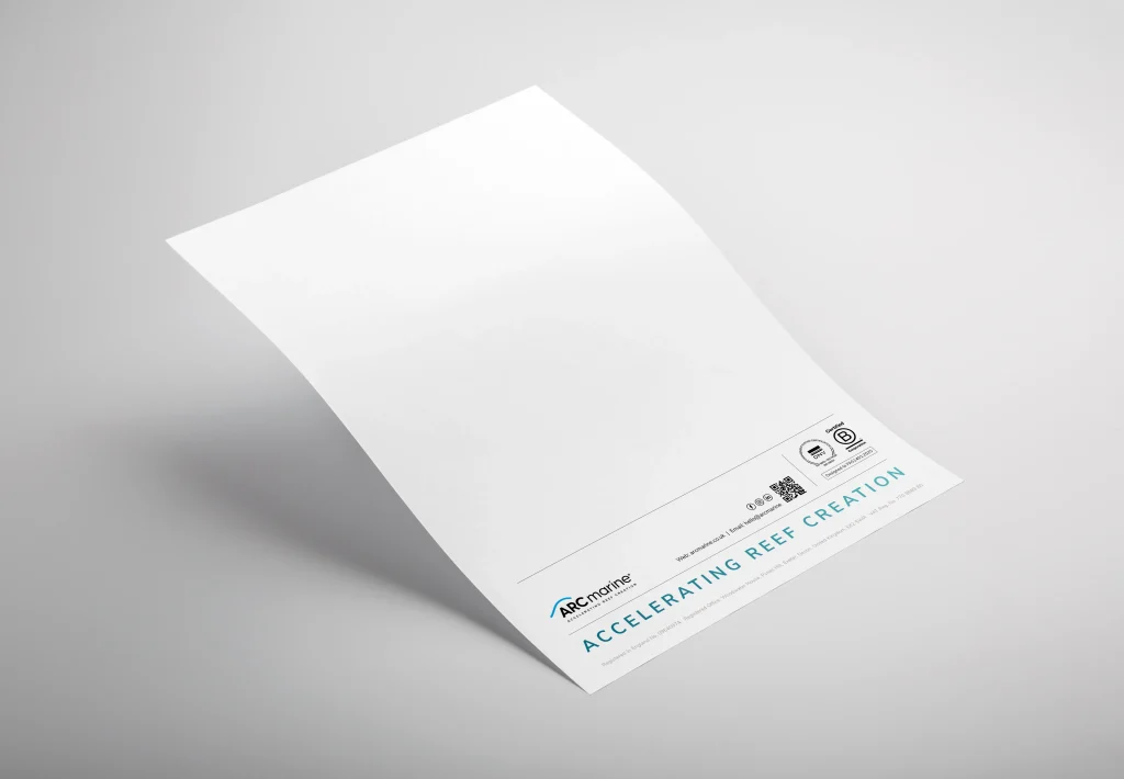
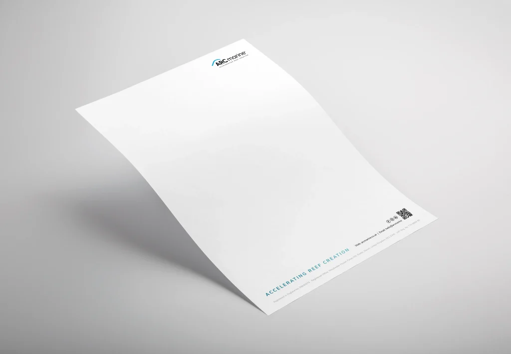
Branded Collateral
From exhibition stand graphics, to stationery, presentations, datasheets and more.
Equipped with new logos, CGI imagery, a suite of advertising concepts, and the insights gained from our consultancy and discovery sessions, we set about developing the full range of brand collateral. This spanned everything from roller banners and exhibition stands to stationery, presentations, datasheets, email footers, and more. Each piece was meticulously designed within the established brand framework, applying consistent typefaces, colour palettes, imagery, layouts, and the intelligent use of white space. The outcome was a cohesive, professional suite of materials that positioned ARC Marine as a credible leader in their sector, inspiring confidence and trust among their global audience.
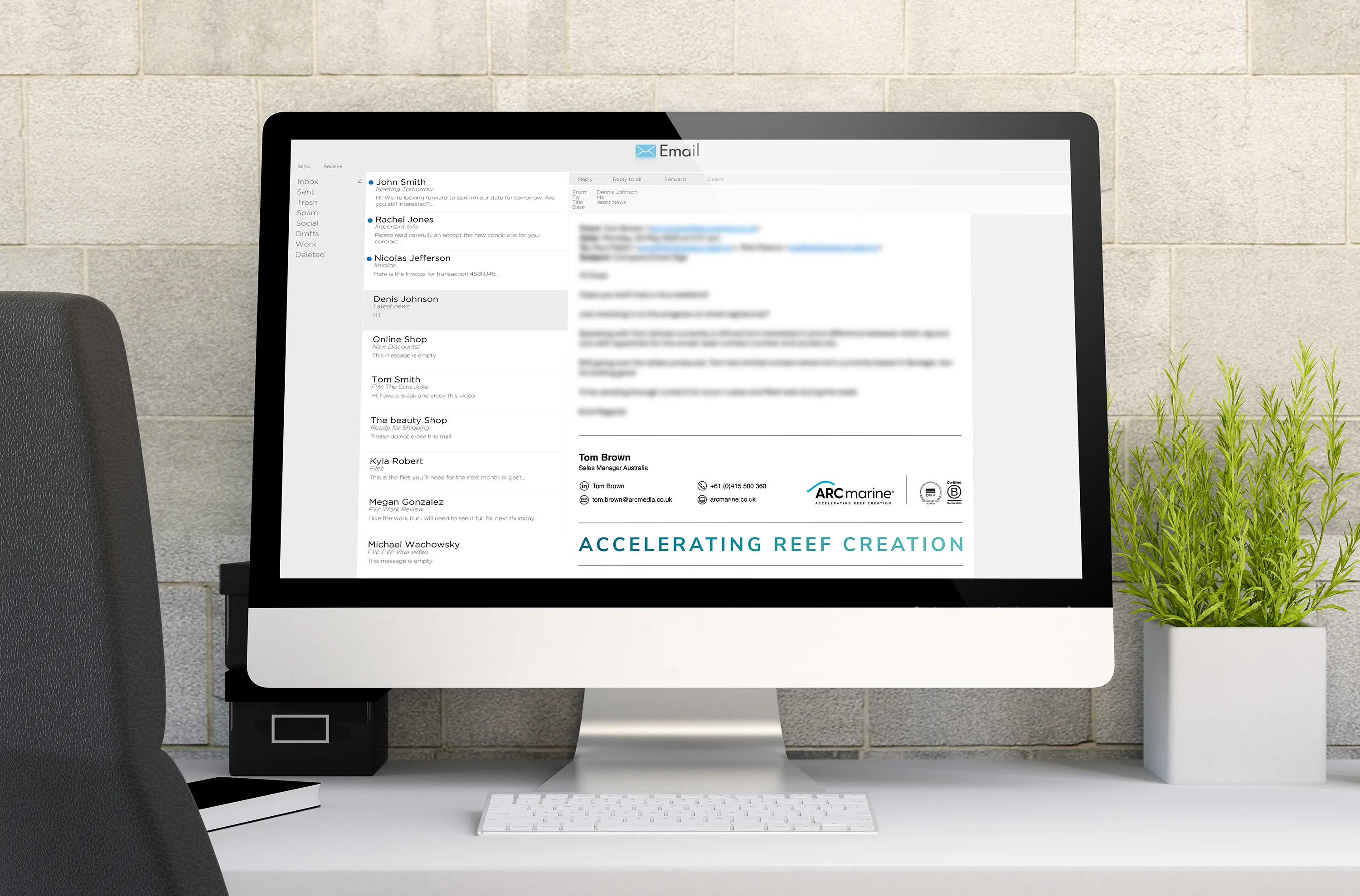
Branded Email Signatures
We ensured the new brand identity was reflected across every touchpoint, right down to ARC Marine’s email footers.
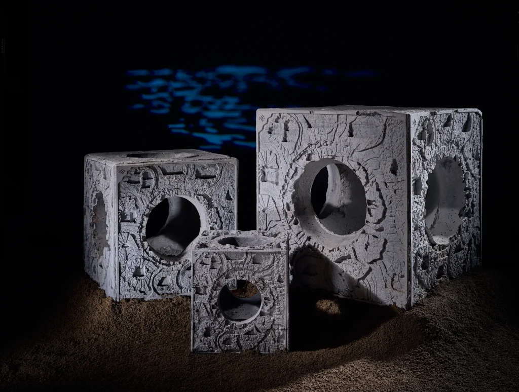
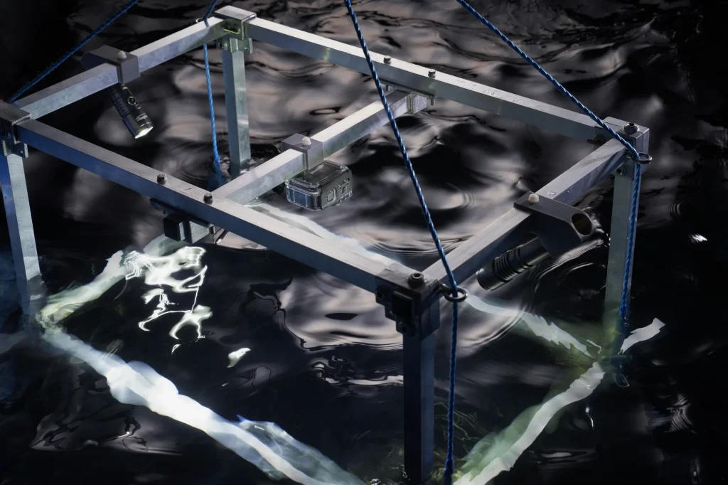
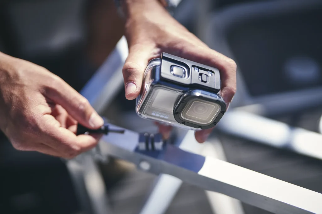
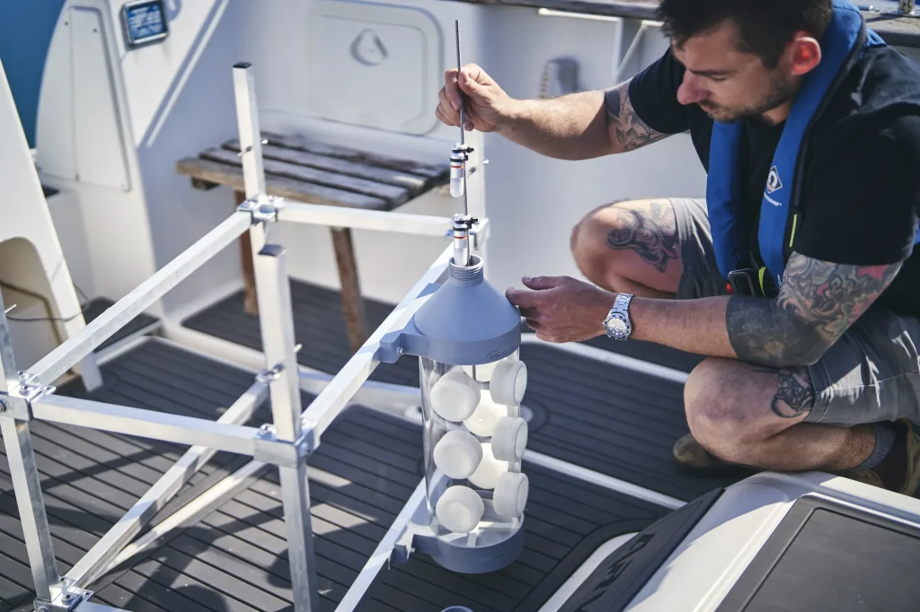
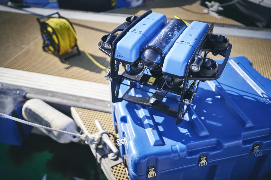
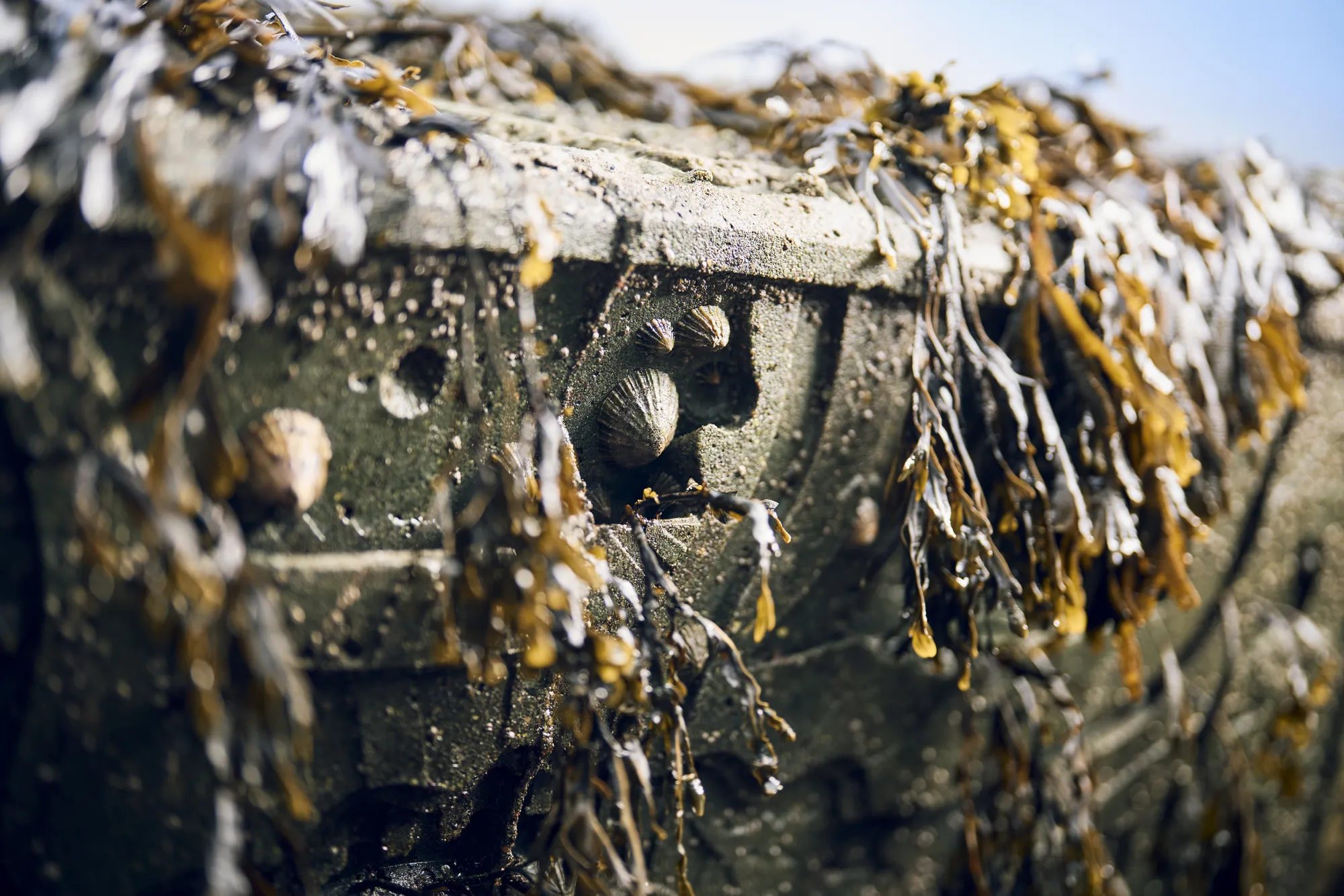
Photography
Showcasing products through artistic photography that elevates and reinforces the brand image.
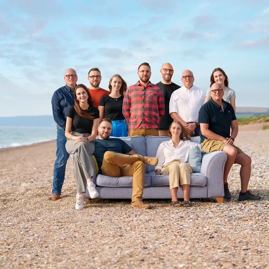
The imagery was captured by world-renowned Mike Evans Photography, with most product shots taken in their natural environments but styled to reflect the creative direction set out in the mood board we had developed during the early stages of the project. Mike’s exceptional eye for detail, combined with his mastery of composition and lighting, produced a striking and versatile suite of images. This growing library of photography not only showcases ARC Marine’s products at their best but also provides a long-term visual asset that will continue to support the brand for years to come.
Website Design, Build, and Host
A sustainably hosted, branded website that is as informative as it is engaging, whilst both accessible and mobile-friendly.
Drawing on the brand strategy, visual styles, and insights gathered during the consultancy and discovery phases, the website was carefully planned from the outset. We held multiple meetings with ARC Marine to capture all the necessary information, enabling us to define the User Experience (UX) and User Interface (UI) in detail before moving into design. Considerable time was invested in this planning stage, ensuring the structure, navigation, and functionality of the site were precisely aligned with the brand’s objectives.
Once the site map, UX, and UI were approved, we progressed to the design and build phase. Every element was crafted to reflect the new brand identity, from imagery and photography to typography, colour palettes, and layout. Throughout, we prioritised accessibility and responsiveness, guaranteeing a seamless experience across devices. The result is a fully branded, professional, and engaging website that speaks directly to ARC Marine’s target audience and supports their global ambitions.